Showing posts with label photography. Show all posts

Tuesday, 9 February 2016

Birmingham Art Trip - Birmingahm Gallery

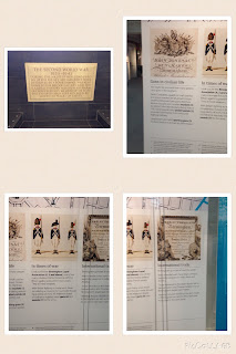
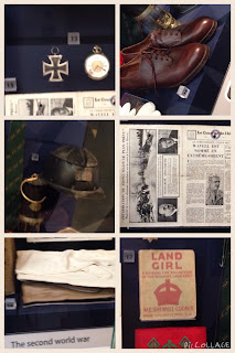
Below are images that were taken from the Birmingham art gallery. This was the only art gallery out of the 3 that linked with my own personal theme 'war' so they are what my photos are based around:


These were buildings/landmarks that I seen between the different galleries.


This was the final gallery that we went to and it was also the best for my theme and from the gift shop I picked up a WW1 replica which is going to be great when doing my work.

Birmingham Art Trip - IKON


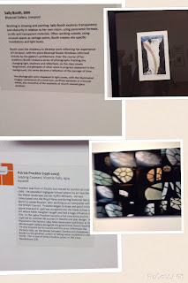
Below are pictures that were taken from the art gallery 'IKON' in Birmingham:


The Ikon was a lot more abstract than the Walsall gallery and it had a lot more stranger pieces of art work but there was also a lot more colour and that was what I liked about it.

Birmingham Art Trip - Walsall

 Below are photos that were taken on the trip to the art gallery in Walsall:


All things fall.

Matt Collishaw's work


Walsall was the first gallery we attended on the art trip. I started from the top floor and worked my way down the gallery. The top floor was my favourite as it had the 'All things fall', which was a sculpture. The room this was in had flashing lights meaning as you watched the sculpture it made it feel as if it was moving and coming to life. (first picture)

Collage - Post Man

This image is Anders Wedin and it is called 'post man'. It is put together with other collages that are similar to make up the 'farfar
project'. The photos used are pictures of Swedish men in the early 1900's who week labours of varying sorts.


I liked this collage because I liked the different style and it mixed in well with my theme because I did the same sort of style but linked it with the theme I have been looking at 'war'. I like the use of the changing a persons personality and appprrence through collage. I also like the use of the mix beyween black and white and bright colours. 

For this collage I went onto the internet and I took a picture of a person wearing their army uniform as I wanted it to like with my own theme 'war'. I also printed out a small poppy as this is linked very well with war and I have been using them in my other studies, and a pigeon as in world war 1 they were used a lot to carry messages. final I chose a similar background to the original photo but in red as the colour also links in very well. In this piece I like the use of the lines In the background which lead you into the main part of the work. I think this piece has good composition as it all links well together.


If I were to do this collage again I would take step-by-step pictures and also I would've found something bright and colourful to go across the hat of the solider and also the uniform.

Sunday, 7 February 2016

Collage - Red Peony


This collage was made by Robert Kushner who was born in America in 1949. The title of this collage is called 'Red Peony III and it was made in 2011. The collage used for the background are book pages that have been mounted up and the drawing on it as a peony which is done in oil and acrylic paint. 


My own: 

Firstly, I started by ripping up news paper in small pieces and filling up the page to make up the background. I used the news paper because I like the effect of the lines that are caused and gives it a broken effect and this works well with the theme because it shows how not everything is clear for example memories.


As it starts to build up I turn some of the words upside down and I mix them all up to show change and I also like this photo because before it is completed it looks like how memories full up the space in your mind. 


Finally, this is the finished piece. For the flower first I used a red and green biro pen and then over the top I used oil pastels and smudged them In to give it more of an effect. I like this Collage because it links well with my own theme as it looks very similar to a poopy. I also used glue over the top of the newspaper to give it a glossy effect.


If I did this again I would do the flower again as I wasn't happy with how it turned out. overall I think it has good composition because the flower stands out bright from the black and white background.

Collage - The Quivering Forest

This collage is made Belgium creator Jelle Martens and is called 'The quivering forest'. He created this piece through imagery and graphics. I like this piece because I like the idea of seeing things in a different way. I also like the use of lines and colour within the image.


My own:
Firstly, I selected 8 different photos all based on war and the colours black, white and red and printed of 4 sets. I linked all of the images to go with my own theme and made them all square so that they would fit together properly.


Secondly, I cut up all of the images and then with a ruler a pencil and then drew a line diagonally form corner to corner.


Next, I cut out all of the pieces so that they were all equal size. I used photos that were off the internet so that the final piece would still have a similar digital affect.


I was happy with the final piece as I think it had good composition and that it all fits together quite nicely. I like how it links well with my own theme but also links with the current theme time and past because the war was what happened in the past and these are memories of what happened. I also like the use of line and colour within the collage.


If I was to do this again I would make it so the pieces are closer together because in my collage between some of them there are slight gaps which means you can see the white page behind it